 ReadingSync
Immerse in Classic Audiobooks, then Master English
Thousands of timeless Project Gutenberg masterpieces — 100% free and completely ad-free! Experience LibriVox audio with word-by-word synchronized text, bilingual lookup, and an SRS vocabulary trainer.
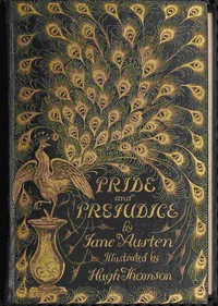
Pride and Prejudice
播放清單 (點選曲目即可播放)
Lectures On Painting Delivered To The Students Of The Royal Academy — Lecture 11 On The Composition Of Decorative And Historical Pictures
ON THE COMPOSITION OF DECORATIVE AND HISTORICAL PICTURES.
The art of composing figure-pictures may be divided into two categories, to each of which I intend devoting a lecture.
The first category will comprise all decorative or semi-decorative work, where grandeur and harmony of line is the great desideratum; the graphic rendering of the subject being of minor importance.
The second category would include almost all easel pictures which aspire to represent some historical event, or to illustrate some anecdote.
In these pictures the graphic rendering of the subject is the first desideratum, and the pleasant harmony of line only the second.
We will deal this evening with the laws of composition for decorative work.
I ought perhaps to avoid using the word “laws”; art is not an exact science, and no strict law can be laid down about a matter of taste.
Still there are certain principles which seem to be accepted by all masters of composition, and certain others which, although not generally accepted, occur to me as likely to be of use to you.
The golden rule for the arrangement of figures in a picture, is that the nature of the subject ought to dictate the lines of the composition.
If you have to paint a subject of a quiet, majestic, and dignified class, a subject for all ages, where you wish to express perfect repose and stability, you cannot do better than go back to the pyramid.
This pyramidical theory of composition has been much quizzed and laughed at, but that is because the old-fashioned dilettanti who advocated it wanted to apply it universally.
Now it is clearly unsuitable for subjects of action, or for filling with figures low long panels; but for altar pieces, or for pictures which are destined for central places, it is at once the most natural and the most effective method.
The quiet and serene dignity of many of the ancient Holy Families and other subjects of sacred art is due mainly to the pyramidical form of grouping.
Sometimes the form is that of a truncated pyramid, as in the Hemicycle at the Ecole des Beaux Arts, where the object of the painter was to represent an ideal Areopagus of Art.
In the compositions of Masaccio and Filippino Lippi we have good examples of a horizontal style of arrangement.
The structure of these groups is suggestive of solid simple architectural forms, and has a kind of dignity of its own; but though suitable enough for frescoes of the fifteenth century, it is hardly picturesque or varied enough for modern oil-pictures.
Mural paintings, particularly when they represent grave or sacred subjects, should more or less partake of this horizontal and rectilinear form of composition.
A certain amount of deviation is necessary, and it is in fixing the limit of this deviation that the skill of the artist is shown.
Too little would make his composition formal and lifeless.
Too much would take away from the symmetry which befits such subjects.
The Stanze of Raffaelle are noble examples of skill and taste in composition.
Nothing can be finer than his “School of Athens,” his “Parnassus,” and his “Theology.
” Here we find variety of line combined with a dignified simplicity.
It is the arrangement and composition of these grand frescoes which in my opinion justifies the position Raffaelle holds in the history of art, rather than the beauty of his Madonnas or the bold drawing of his somewhat over-rated cartoons.
Later artists of the Roman school overdid the picturesque element, and lost the stately simplicity which characterizes the second manner of Raffaelle.
In modern times, Ingres’ “Apotheosis of Homer” is a good example of what a mural painting should be.
Severe in drawing and dignified in composition, it is yet by no means deficient in those more attractive qualities which are commonly expressed by the word “picturesque.
” Flandrin’s frieze at St. Vincent de Paul is another magnificent specimen of an exquisite sense of fitness.
There is hardly a figure in the whole procession of apostles, saints, and martyrs, which could be improved.
I
know of no modern work which is so perfect of its kind.
It is, of course, preposterous to suppose that good composition can be taught in a couple of evenings; but if I succeed in impressing on you the importance of this rather neglected branch of study, I shall not have lectured in vain.
We will begin with the simplest problem, namely, how to fill up with figures an elongated rectangular space or frieze.
The most obvious method is to set up a row of figures of the same size and all in profile, as was done by the ancient Egyptians.
Now this mode of treatment, though suitable enough for the Nile temples, would obviously be unfit for buildings of the nineteenth century.
The figures should preserve a certain regularity, a certain frieze-like arrangement, and yet the attitudes should be varied, and the work should not look as if it had been done by machinery.
The first improvement on the Egyptian method would be to break the monotony by here and there grouping two or even three figures together.
As in these groups of two or three one figure must be behind the others, and therefore farther off from the spectator, it would be smaller, the head would be lower, and you would at once get a little variety in the line of heads.
To vary your line of heads simply by arguing that some people are six feet high whilst others are only five, does not answer in decorative painting.
You _may_ assume that the male figures are bigger than the female, but you must proceed as if your men were all of the same (or very nearly) of the same height, and your women ought also to vary very little in stature.
Children you may introduce of any size, from the infant in arms to the youth or maiden of fifteen; but let them be unmistakably children, and not little men and women.
The individual action of the figures would of course depend very much on the destination of the work.
If it were intended for the decoration of a church, the figures would of course represent patriarchs, apostles, or martyrs, and a severe and simple arrangement would be necessary.
If, on the other hand, your frieze were to decorate a theatre or ball-room, the figures should have more action, and naturally the lines would be more broken.
Whatever the subject, however,--whether maskers, musicians, or morris-dancers,--there should be a certain frieze-like symmetry in the composition.
You should never forget that you are engaged on a decorative work, and not on an easel picture.
A rule which it is well to observe in all decorative work is to avoid cutting off any portion of the figures.
This is quite unavoidable in many easel pictures.
If you have a crowd of people to represent, you cannot isolate some of them so completely that no portion of the others should be visible.
An easel or gallery picture is bounded on every side by the frame, and the eye is not shocked at all by seeing portions of the figures cut off.
Although every one knows that the figures do not extend behind the frame, yet it is easy to suppose that they do, and the eye allows itself to be cheated into this belief; but in decorative or mural painting there is no solid framework round the picture isolating it from the surrounding wall.
There may be an ornamental border or possibly a light moulding, but this is not enough to permit the practice.
Michael Angelo, in his decorations of the Sistine Chapel, often carried his figures and draperies right out of the panels allotted to them, and this boldness adds to the grand, free character of the work.
The problem of how to fill up the irregular-shaped wall spaces which continually occur both in Gothic and Palladian architecture is of course more complex.
These spaces have generally curved sides, and in many of them--as, for instance, the spandrels of arches--the curve is concave.
Straight horizontal lines of heads which are generally so desirable for long rectilinear spaces here become very objectionable.
Bold convex outlines for the groups, and an arrangement for the heads which does not suggest either horizontal or vertical lines, ought to be the rule in these cases.
Nothing can be finer than M. Angelo’s treatment of the sybils and prophets in the Sistine Chapel.
There is a majestic dignity about them which is due rather to their full convex outlines than to their colossal proportions.
On the other hand, in many of the compositions by the early Florentines we have long horizontal rows of heads which seem out of harmony with the arched space they fill.
The circular nimbi take off somewhat from the meagre character of these lines, and there is considerable beauty about the individual figures, but viewed as decorative works they are very unsatisfactory.
It is, of course, impossible to devise rules for all conditions of decorative and historical painting, but a few general hints may be useful to you.
1st.
Beware of concave lines for the outlines of your groups.
2d.
Avoid sharp angles, and particulary right angles, unless you wish to draw special attention to them.
3d.
Be very careful about the relative position of the heads, so that viewed as points of interest they do not form any regular geometrical pattern.
These three rules seem to me the most important ones to be observed in the composition of decorative figure-pictures, and we will examine them _seriatim_.
The first rule I have given is to avoid concave forms for the general outline of the groups.
There is no rule without exceptions, and to this one there are a good many; still it will be found that, speaking generally, convex outlines give grandeur wherever they are introduced.
This convexity in the form of the groups need not be dependent on the outlines of the figures themselves; it may be got by introducing drapery or other accessories.
I know of no example showing the value of full convex outlines more strikingly than the Madonna di S. Sisto.
In the pictures of the Umbrian school, on the contrary, we find extreme poverty of line.
The figures themselves are not particularly attenuated, but they are not sufficiently connected together nor enveloped in those useful pieces of flowing drapery which give such grandeur and fulness to the works of Fra Bartholomeo, Sebastian del Piombo, and other painters of the Roman school.
I have in former lectures entered fully into the subject of convex lines being almost always associated with forward movement, and concave with retreat, and need not go over the same ground again.
I would, however, observe that the terms boldness and convexity are almost synonymous when applied to outline; thus when we speak of a mountain having a bold outline, we mean that though steep and precipitous it is bluff or convex in form.
A mountain with a depression on the top, or surmounted by a sharp-pointed cone, would hardly ever be noted for its bold outline.
The second rule to which I wish to call your attention is the avoidance of right angles in the composition of your figures.
All angles, unless they be obtuse ones, are to be deprecated, but the most objectionable of all are the right angles.
In a single figure, rectangular outlines are not so unpleasant, but I cannot agree with those who think that the big seated Egyptian figures with which we are all familiar, owe their grandeur to their rectangular contour.
I have no doubt but that these gigantic figures in their native swamp, and illumined by an Egyptian moon, would look very imposing, but the solemn grandeur of their aspect would be due to their size and to their surroundings, and not to their harsh rectangular outline.
If the “Moses” of Michael Angelo could be magnified to the size of these figures and transported to the banks of the Nile, I fully believe he would be far more impressive.
Simplicity and grandeur are often bracketed together as though the terms were almost synonymous; but they certainly are not so.
The street and chapel architecture of the Georgian era was simple even to baldness, but no one can call it grand.
It is not, however, in single figures that right angles are so much to be avoided, as in complicated groups of several figures.
Here they arrest and distract the eye, giving harshness to the composition, and destroying the look of spontaneous action and easy-flowing movement which figures always should have.
Rubens in his “Descent from the Cross” has avoided these disagreeable angles, but in many of his more careless compositions, where there is violent action, they are painfully conspicuous, in spite of his liberal use of flying draperies.
Hence his cavalry skirmishes, though full of violence and contortion, are quite wanting in spontaneous “go.
” Right angles in a group of figures convey the idea of immovability.
Hence, although generally undesirable, it is well sometimes to introduce them.
[Illustration] Thus a kneeling warrior firmly planted to resist onslaught might with propriety have both knees right angles.
[Illustration] In this case we wish to give the idea of fixture, and therefore rectangular forms are not only allowable but very useful.
Again, in the case of a wounded man endeavoring to raise himself, the angle formed by his right arm might with propriety be a right angle, because we want to show that the man is wounded and cannot raise himself without difficulty.
[Illustration] If he were uninjured and in full possession of his strength, we ought to represent his springing up in some other way.
In the very frequent case of two arms crossing each other, they should not cross at right angles.
There is no reason here for expressing immovability at the point where the arms cross, and therefore the formality of right angles should be avoided.
We will now pass on to the third rule, namely, that relating to the heads of the figures.
Whatever the subject of the picture, the eye is always attracted to the heads.
It is therefore of the highest importance that their relative positions should be carefully considered.
[Illustration] In the annexed diagram, it is of no use arguing that one of the heads is a full face, another three-quarters, a third a profile, and the fourth a back view of the head.
The four heads are all points of interest.
They are equidistant, and placed on a segment of the same circle, and, turn them whichever way you will, you cannot get rid of the unpleasantness of the arrangement, so long as you keep them in their present relative positions.
[Illustration] In the next figure we have four heads suggesting a quadrilateral of lozenge shape.
[4] This is also very objectionable, and it is a case of frequent occurrence.
In both these diagrams, by shifting the position of one of the heads, we should break up the symmetrical arrangement which so much offends the cultivated eye.
[Illustration] There is no objection, in a composition of many figures, to placing two or more heads on the same horizontal line.
Indeed, in many cases it is most advantageous to do so; but what ought to be avoided is having heads on the same _vertical_ line.
If you have a kneeling or sitting figure in front of an erect one, arrange your kneeling figure so that the one head shall not be perpendicularly below the other.
[Illustration] If you have two erect figures, arrange your kneeling figure so that the head shall not come on the same vertical line as either of the other heads, or half-way between the two.
[5] I might urge a good deal more about the extreme importance of a picturesque and irregular arrangement of the heads; but I have probably said enough to call your attention to this very prominent feature in good designing, and will now give a few hints about other kindred matters.
[Illustration] Converging lines are to be avoided, unless there is something of interest to which you wish to direct attention at the point of convergence.
This is by no means an exaggerated specimen of the evil;
but the effect of these four arms all converging toward one point is unpleasant.
If the personages were disputing over a manuscript, or trying to clutch a bag of gold lying on the table, then the manuscript or the gold would be the centre of interest in the picture; and converging lines would not only be excusable, but absolutely necessary.
Where there is nothing of particular interest at the point where the lines meet, the eye feels disappointed at being misled.
[Illustration] Although converging lines are generally to be avoided, it often happens that a repetition of the same kind of curve gives force and unity of purpose to a group.
Observe the convex curves formed by the backs of these suppliants.
Their repetition gives unity of purpose.
A
perpendicular kneeling figure might individually be just as expressive, but as one of a group he would take away somewhat from the general character of unity in supplication.
One of the most difficult problems the designer of large mural pictures has to solve, is to introduce with good effect raised arms and hands, especially when they belong to the background figures.
When possible, it is better to keep them out of sight altogether; but in some subjects you would by so doing inevitably lose expression and animation, and it becomes necessary to introduce here and there an upraised arm with extended hand.
This is easy enough to do if you are reckless about the lines of your composition, but if you are fastidious, it is a very difficult problem.
In the first place, they distract the eye, destroying the full bold outline of your groups, and, secondly, there is a comic element about them which it is rather difficult to avoid.
When, as in many of Raffaelle’s Loggie, the whole of the figures which are raising their arms are seen, the effect is bad and trivial; but there is nothing particularly comical about it.
When, however, an arm crops up here and there from the unseen figures of the background, it is difficult to avoid the ludicrous.
Cases may occur when a whole forest of hands will have to be raised, as in an oath of allegiance; but here the action of raising the arms is inseparable from the subject.
My remarks apply only to upraised arms as indicative of wonder, joy, or grief.
All these hints about designing may appear to some of you rather far-fetched, but if ever you get experience in decorative painting, I think you will find they are not far from the truth.
The art of good grouping is not of spontaneous growth.
You may have a general idea of how you are to fill your canvas or wall-space, and that idea may be a good one, but all the details of the groups have to be worked out bit by bit.
A change in the attitude of one figure will be almost sure to entail a change in a good many others, and it often happens that, after giving yourself a good deal of trouble, you will have to go back to your first idea.
A conscientious and fastidious designer may be compared to an Arctic explorer picking his way in an ice-pack.
He will have to saw through one ice-barrier, to blow up another with gunpowder, to circumvent a third, and when, after surmounting all these difficulties, he thinks his course clear and open water at hand, he may have to retrace his steps and seek some other channel.
I am perfectly aware that in painting small easel pictures all this groping after fine lines may be unnecessary, nay, even detrimental to the life-like spirit of the composition.
“Our own correspondent’s” sketches at the seat of war (if done on the spot, which I am afraid they not always are) will be not only more interesting but better composed than if he had sat at home and trusted to his imagination; but in this lecture I am not dealing with easel pictures and realistic subjects, and I repeat that in decorative figure-painting excellence can only be obtained by a continuous process of altering, modifying, adding, and omitting.
In the same way that the lines and general grouping of a picture should be arranged with a view to expressing the subject with dignity and grandeur, so the management of light and shade should tend toward the same end, and it is as impossible to lay down strict rules for light and shade as for outline designing.
Didactic writers on art will tell you that the principal light ought to fall on the principal figure-- “Fair in the front in all the blaze of light, The hero of thy piece should meet the sight.
” Sir Joshua Reynolds remarks very justly on this piece of doggerel, that there is no necessity for the principal figure to be placed in the middle of the picture, or receive the principal light.
He goes on to say that “this conduct, if always observed, would reduce the art of composition to too great a uniformity,” and that “it is sufficient if the place he holds, or the attention of the other figures to him, denote him the hero of the piece.
” In works which partake strongly of a decorative character this axiom about “Fair in the front in all the blaze of light” for the principal figure may be tolerably true, but in historical pictures something more unforeseen is wanted.
In the often-painted subject of the “Death of Cæsar,” I should be very much inclined to put the Cæsar in the shade, and the tyrannicides with their flashing daggers in the light.
It appears to me that to throw a shade over the face of the prostrate emperor would somehow or other convey the idea of the shadow of death, which is overspreading him, and the reproachful “Et tu Bruté” would come with greater pathos from a figure half-veiled in shadow than from one in broad daylight.
We will suppose now that instead of having the death of Cæsar to paint we have the “Stoning of St. Stephen.
” The subject is analogous.
The young man named Saul and the Jewish executioners of Stephen were not common assassins any more than the murderers of Cæsar.
Shall we, therefore, adopt the same plan with the figure of Stephen as we did with that of Cæsar and put him in the shade?
I say, Certainly not.
Stephen was the first Christian martyr.
We read that his face was as that of an angel, and he ought to be surrounded by an angelic halo of light, and this treatment need not be dictated by the text.
We should come to the same conclusion simply on the grounds of pictorial fitness.
Stephen was a voluntary martyr, and gloried in his own death.
Cæsar was assassinated much against his will; and although we are told that he covered his face with his toga and died with dignity, yet he certainly cannot be called a martyr.
I have introduced these two subjects to show you how hopeless it is to attempt to lay down general rules such as old Du Fresnoy gives us in his poem on the art of painting.
Every new theme you undertake to illustrate ought to have a treatment special to itself if you wish to produce a fresh and original picture.
When the master of a vessel is starting on a voyage, he would not steer S. W.
by W. ½ W.
because that happened to be the course he steered the last time he was at sea, nor would he run up his skyscrapers and set his studding-sails because he carried all his light canvas the last voyage out.
He would consult his chart, the state of the tide, the direction of the wind, and act accordingly.
In short, for this new voyage, the condition of the wind, tide, and barometer being new, he would give new orders to his mate and crew.
Substituting the brain for the master, the hand for the mate, and the brushes for the crew, we ought to set about our pictures much in the same way.
After giving the subject of light and shade a good deal of thought, it appears to me that there is only _one_ rule which invariably applies to all pictures, and that is, that there should be a uniform scale of tone throughout the work.
The gradient, from light to shade, may be very steep as in Rembrandt, or very gentle as in P. Veronese, but this gradient or transition should not be abrupt in one part of the picture, and gentle in another.
The whole work (whatever scale you adopt) should be homogeneous.
Sir.
J.
Reynolds and others have endeavored to ascertain the proportion of light to shade in the works of the old masters.
I believe these experimental blots have been made rather with a view to black and white than legitimate light and shade; but whatever their object, I don’t think that any theory can be built up on them.
I am convinced that what the old masters called the _chiaro-oscuro_ of their pictures was a matter of feeling, and sometimes of accident, but never of calculation.
Theorists often talk learnedly about secondary and tertiary lights, but the artist never dreamt of them.
They are nothing more than the efforts he has made, and the means to which he has resorted, in order to connect the highest light of his principal group with the gloom of his background.
Rembrandt’s vigorous light and shade and Correggio’s luminous breadth ought to be ascribed to the natural idiosyncrasies of the painters, intensified probably by the conditions under which their works were executed.
They were assuredly not the results of calculation or learning.
Modern artists are often credited by their critics with subtleties of which they are perfectly innocent.
They introduce into their pictures certain harmonies of tone or color by a kind of pictorial instinct, but certainly not in obedience to theoretical laws.
In designing a composition of many figures, it is natural to begin with the principal group or centre of interest.
When you have got this satisfactorily arranged, you proceed with the less important figures, and it is here that beginners (and some who are by no means beginners) often come to grief.
They get a fine action or a noble attitude for some accessory figure, and they are so much in love with it that they _must_ introduce it, whether it is in keeping with the principal group or not.
It may (viewed as a single figure) be very good, and yet be injurious to the general harmony of the composition.
Recollect that accessory figures, however good in themselves, if they mar the general effect, ought to be sacrificed.
By so doing you will doubtless raise a cry of lamentation from your friends.
They will say, “What _could_ have induced you to have scraped out that figure?
Why, it was the best thing in the picture,” and so on.
To which you might reply that you did not want it to be the best thing in the picture, and therefore you erased it.
It was this tendency to introduce some favorite figure where it was not wanted, which rather mars Raffaelle’s latest manner, as exemplified in the “Transfiguration,” and in the “Incendio del Borgo”; and what in Raffaelle was only an incipient tendency became a confirmed habit in the work of his imitators.
Sir J. Reynolds, in his discourses, is continually urging the student of composition to think how the old masters would have treated the subject he is engaged upon, and advises him to imitate their style and manner.
Indeed, the sixth discourse is devoted entirely to this principle of imitation.
Now, if we were vastly superior to M. Angelo, Raffaelle, and Titian, and held the same relative position to them that they did to their predecessors, I could understand our occasionally adopting their figures, after greatly improving them; but as we should not be likely to improve any figure we had appropriated, we had much better leave the old masters alone.
Plagiarism, or, to use a plainer word, “stealing,” can only be excused when the plagiarist makes a better use of the property he has appropriated than the original possessor did.
Sir Joshua certainly says that you should “imitate,” and not copy servilely.
Imitation is the sincerest form of flattery, and if Philippino Lippi could have seen Raffaelle transferring _his_ St. Paul into the famous cartoon of the saint preaching at Athens, no doubt he would have felt flattered.
But how about Raffaelle?
Is it not true that this plagiarism on Raffaelle’s part detracts somewhat from his fame?
Does not every one, on seeing the Carmine Chapel at Florence, and recognizing the familiar figure of St. Paul, think somewhat more of Philippino Lippi and somewhat less of Raffaelle?
I believe that nothing can be more fatal to the career of an artist than _intentional_ imitation of another man’s work.
I say “intentional,” because we are all more or less imitators quite unconsciously.
We often confound a reminiscence of something we have seen in a picture with a reminiscence of nature, and so become unconscious imitators; but this is a very different thing from deliberately setting aside our own ideas and endeavoring to fancy what would be the ideas of some one else.
It may be argued that Sir J. Reynolds addressed his advice to students and not to mature artists, but the habit of imitating others, when once acquired, is not easily got rid of.
A certain degree of excellence may doubtless be attained by following this method, provided the masters imitated are excellent, but, after all, it is only a kind of reflected light, and not to be compared to the electric light of original genius.
Besides, the student who follows Sir Joshua’s advice may begin by honestly attempting to paint his pictures in the _style_ of Raffaelle without downright imitation of the figures, but he soon learns to adopt Raffaelle’s attitudes, Raffaelle’s expression, and even Raffaelle’s mannerisms.
He becomes, in short, a mere copyist.
If this be deplorable in the case of the imitator of Raffaelle, how much more deplorable is it to adopt the modes of thought and expression of an inferior master!
It may be thought by some that in these lectures I often speak disrespectfully of the old masters, but it is certainly not my intention so to do.
I have the greatest respect for many of them, though not for all; but I respect nature and truth still more, and it appears to me that the true artist should go to the fountain-head for his ideas and inspiration, and not to second-hand sources.
It may be answered that it is all very well saying that an artist should go to nature and rely on his own powers of creation and invention, but supposing he is relying on a broken reed; suppose he cudgels his brain in vain for ideas, what is he to do?
In this case I should advise him, instead of borrowing from the old masters, that he should turn his attention to portrait-painting, landscape, or some branch of the profession where the creative and imaginative faculties are not much required.
He may have great imitative power with a dexterous execution;
he may be a charming colorist, or, again, he may be a refined and accomplished draughtsman, and yet be totally unable to give dramatic vitality to a scene he has not himself witnessed.
It has always been the fashion to apply the term “high art” to heroic or Scriptural figure-subjects, but I think there is almost as much high art in a noble portrait of Titian or a fine landscape by Claude as in any historical painting whatever.
I object to the term altogether; but if it means any thing, it ought to mean a dignified and poetic view of nature, in contradistinction to a trivial or prosaic view.
It ought certainly never to be applied to a pasticcio of the old masters, however plausible such an imitation may be.
In my opinion there is high art in Turner’s early pictures, because in them we get the man’s own poetic interpretation of nature, but in those works where he attempts to rival Claude I can see nothing but the labor of a skilful imitator.
I have wandered away from the proper subject of this lecture, and have but little time left; but before concluding I should wish to explain that although I am continually urging the extreme importance of _originality_ in painting, I do not mean forced singularity or oddity.
I
mean by the word, the expression of the painter’s own sober ideas.
A
sane man should produce sane work.
It may not be very powerful, it may in no way recall Michael Angelo, but it will have qualities of its own.
How charming, simple, and unaffected are Flaxman’s designs until he got inoculated with the Sistine Chapel lymph!
After this inoculation we notice (at least I do) a great change for the worse in his compositions.
To graft successfully, the parent stem ought to be of the same nature as the scion or graft.
Now Flaxman’s nature was gentle, and very appreciative of beauty and grace.
With such a nature he ought to have abstained from attempting the grand and the terrible.
If Flaxman erred in grafting Michael Angelo’s manner on his own, what shall we say about Blake?
Flaxman was at any rate a good draughtsman, but Blake’s ignorance of the first principles of drawing makes his Michael Angelesque imitations simply ludicrous.
The successful attempts which have been made of late years to rehabilitate Blake, and to elevate him into a kind of British Michael Angelo, make me almost despair of high art in this country.
I do not wish to speak contemptuously of Blake as a poet, but in his pictures (even supposing he had grand ideas) I cannot accept the will for the deed.
The frog in the fable had grand ideas when he wished to rival the ox in size, and yet he only made himself ridiculous.
Were I to express all I think about the Blake revival, I could hardly confine myself to parliamentary language.
I
will, therefore, in closing my lecture, simply protest to the best of my power against this strange infatuation.
權人設
們使瀏覽 (Local Storage) 來住您主題好、體大小、以後播目進度字本