 ReadingSync
Immerse in Classic Audiobooks, then Master English
Thousands of timeless Project Gutenberg masterpieces — 100% free and completely ad-free! Experience LibriVox audio with word-by-word synchronized text, bilingual lookup, and an SRS vocabulary trainer.
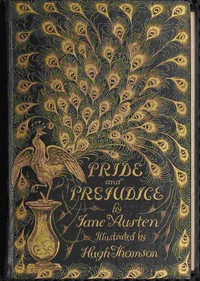
Pride and Prejudice
播放清單 (點選曲目即可播放)
Lectures On Painting Delivered To The Students Of The Royal Academy — Lecture 7 Color
LECTURE VII.
COLOR.
Lectures on color are generally semi-scientific discourses.
The lecturer explains the theory of primaries and secondaries, and the optical effects produced by contrast, illustrating what he has got to say on the subject by means of colored diagrams.
Those who are interested in the singular effect produced by what are called simultaneous and successive contrasts of color had better consult Chevreuil’s book on color, which has been translated into English, and is a very exhaustive work on the subject.
From a very slight knowledge of the book I should say that it was more likely to be of use to the designer and manufacturer than to the artist.
The author deals almost entirely with flat surfaces of color, and the weakest part of the book is that where he tackles the complex problem of reducing to rule the coloring of pictures.
Some of his theories appear to me very fanciful, and some are quite contrary to my own experience.
Indeed, it is a question to me whether a scientific knowledge of optics in their relation to color can be of any use to an artist in his profession.
After this preamble you will not be surprised if I do not exhibit to-night any prisms or kaleidoscopic effects of color.
Moreover, I don’t know enough of the subject to venture to lecture on it.
I shall give you the results of my experiences (_quantum valeant_) not only about colors, but about such prosaic matters as brushes, palettes, and mediums.
It appears to me that many a student is kept back or discouraged because his palette is in a hopeless mess; his brushes are like old birch-brooms, and his canvas is slippery and greasy.
If you were learning to write, instead of learning to paint, you would not provide yourselves with stumpy worn-out pens, bad ink, and cartridge paper.
You would get fairly good pens and ink and white foolscap, so as to give yourselves a chance.
I don’t wish you to be fastidious about the choice of your materials.
This is as bad as being too careless; nor do I want to bind you to use the colors and brushes which I myself find most convenient for life studies.
All I desire is that you should not multiply your difficulties unnecessarily by using bad materials.
Before, however, entering on these details, I wish to make a few observations about the effect and contrast of colors.
In the first place, I would observe that, pictorially speaking, no color can, taken individually, be called either pretty or ugly.
The dullest mud-color, if in its right place, is charming; and the most delicate mauve, if in the wrong place, hideous.
Dirt has been defined as matter in the wrong place.
No one while digging among his flower-beds would call the rich mould “dirt,” but if he proceeds to wipe his spade with his pocket-handkerchief, he will certainly “dirty” it.
In the same way when in a picture we speak of a color being ugly or dirty, all we mean is that it appears so with reference to its surroundings.
Take the same color and put it in a more harmonious setting, and it will appear all right.
We are told by scientific writers on color, that the primaries (red, yellow, and blue) harmonize with their secondaries, viz.
, red with green, yellow with purple, and blue with orange.
This is no doubt true in a general way, but it is by no means invariably true.
Any color will, under certain conditions, harmonize with any other, provided they are of the proper shade, and the surrounding setting and background are suitable; whilst, on the other hand, we often see in pictures by bad colorists the most orthodox combination of reds and greens, which, instead of being harmonious, are painfully discordant.
The truth is that color cannot be subjected to theoretical rules.
The only safe book for the student to consult is the Book of Nature.
He will there find no limit to the harmonious combinations of the primary and secondary colors.
Do the golden blossoms of the ragwort or the blue-bells of the wild hyacinth not harmonize with their respective green leaves?
Are the orange orchards of the South, or the mingled blue, green, and gold of the peacock’s plumage, unpleasant to the eye?
And yet these combinations of color violate the rules laid down by theorists.
Another obvious truth to be gleaned from Nature, and which may be made applicable to art, is that she varies her tints according to climate.
In the plumage and coloring of exotic birds and insects we find the most gorgeous combinations of bright colors.
In the parrot-house of the Zoölogical Gardens we see red and blue, orange and purple, blue and green plumages of the most brilliant hues.
The coloring of these birds, although not as discordant as their voices, seems in our gray climate too crude and violent, but in their native tropical forests, with an intensely blue sky overhead, the crudity would disappear, and they would be as much in keeping with the surrounding scenery as eagles and hawks are on our mountains, black and white seafowl on our coasts, or sparrows in our streets.
The truth appears to be that in color there are various scales of intensity and strength.
If the key-note, or, in other words, the most decided color in your picture, be strong and vivid, you will have to carry out the whole picture on the same scale.
If it be of a delicate or neutral tint, you must treat the remainder of the picture accordingly.
Good specimens of old stained-glass windows, where the strongest reds, blues, greens, and yellows are seen in juxtaposition, are fine examples of a powerful rich harmony of color, and many pictures of the Dutch school are very good illustrations of harmony of a delicate gray kind.
This sort of low-toned harmony is much more easily obtained than the stronger and richer kind.
The reason for this is that faults of color and errors of taste are much less conspicuous in a gray picture than in a brilliantly colored one.
In the former all the costumes are of a whitey-brown, buff, or slate color, and an injudicious distribution of these Quaker-like tints would be hardly noticeable; but in a work where strong reds, yellows, blues, and blacks predominate, the substitution of one color for another would be fatal to the picture.
In landscape again, it is far easier to paint the gray land of mountain and mist than the brilliant sunshine of the South.
Any one who honestly attempts to depict the blue Mediterranean sparkling in the sunshine will probably be severely criticised, whilst his neighbor who has painted the kind of Highland scenery we all know so well, will get praised for his painstaking truthfulness, although his picture may be in every respect inferior as a transcript of nature to the Southern one.
The axiom to be derived from this is, that whatever your subject may be, whether figures or landscape, it is comparatively easy to succeed as a colorist in a low or gray scale of color.
I do not mean to recommend any shirking of difficulties, and if your subject is of a nature which requires brilliant coloring, by all means endeavor to paint it up to the mark; but in decorative work, and in pictures which admit of a tender and soft coloring, you will do well to select grays, bluish greens, and broken tints generally.
Your shortcomings will be less conspicuous, and you will avoid the risk of becoming tawdry and vulgar.
Some men are born with a strong natural feeling for color, and a good many more fancy they have this gift without really possessing it.
Some have an exceptionally dull sense for color, and although they may be quite able to distinguish red from green, yet they cannot be taught to discriminate between different shades of the same color.
To students belonging to any of these three classes I am afraid my lecture will be of no use.
The first--that is, the born colorists--will instinctively use harmonious tints, and their natural feeling will be a better guide to them than any lectures.
The second class--namely, those who fondly believe themselves to be colorists--will, of course, not attend to any thing I may say; and those to whom nature has denied a sense of color are unteachable, just as it is hopeless to teach music to a man who has no ear.
The great majority, however, of students belong to none of these exceptional classes.
They have an average sense of color, just as they have an average sense of form; and although I am quite aware that practice and experience will alone improve and develop their power of coloring, yet a few practical hints may facilitate and shorten their studies.
I assume that whatever method is adopted for painting flesh, the object ought to be to get it like nature.
I don’t mean necessarily like the model, but like what nature would be under the conditions imposed by the subject, and it is very necessary continually to bear in mind what those conditions are.
It will not do (if you have an open-air subject to paint) to copy your model faithfully as he appears in the studio, and then put in a sky and background from your out-of-door studies.
Although the whole picture might truly be said to be painted from nature, yet it would certainly not look right.
The figures would have been painted under one condition of light, and the landscape under another.
You cannot be expected, except under peculiar circumstances, to paint direct from your model out-of-doors, but you may take careful notice of the difference between studio light and shade and open-air effect.
I
must do modern painters the justice to say that this difference is much more generally recognized than it was twenty years ago.
Formerly a group of figures used to be painted with more or less care from models as they appeared in the studio, the aperture which admitted light being often not more than three or four feet wide.
It was immaterial to the artist whether the scene of his subject was an apartment similarly lighted, or an open heath; and the consequence was that the picture, however cleverly it might be painted, had an unreal appearance whenever a landscape background was introduced.
This discrepancy must have been felt, and hence no doubt we may account for the perfectly conventional landscape backgrounds we notice in many pictures by the masters of the last century.
Instead of the old artifice of spoiling the landscape for the sake of the figures, it is much better and healthier art to paint the figures to suit the landscape.
We cannot do this completely unless we paint the whole picture on the spot, and then we should not have the same command over the arrangement of the groups as we have in the studio; but we _can_ make an approximation toward this desirable end, and it is satisfactory to notice that many young artists, both French and English, are making efforts in this direction, and thus studying the ever-varying effects of color and light in the only way in which they ought to be studied.
If you do not feel equal to the task of thus modifying your studio work, choose some subject where the scene is an interior, analogous to your own room, and then you may copy literally the color and light and shade of your models and draperies.
I am not going to give any recipe for painting flesh; some English artists and the great majority of foreigners paint it in at once as near nature as they can.
Others model it first in what is technically called dead color, and finish with transparent or semi-transparent tints.
If the result is good, it matters little how it has been obtained.
Every artist has his own method, and he generally adheres to it, either because he is accustomed to it, or because it suits his style of composition and drawing.
I shall therefore confine the remarks I have to make on color to the harmonious arrangement of backgrounds, draperies, and costumes.
First, as to backgrounds.
It is a curious fact, which any one can verify, that if you have painted a head and you find the color too hot and red, the proper remedy is to paint the background of a cool green or some cold color.
Naturally one would suppose that on the principle of contrasts the cool-colored background would make the head appear redder.
Such, however, is certainly not the case.
A vermilion curtain behind your rubicund gentleman would make him appear more objectionably rubicund, but a cool gray or green would have the contrary effect.
On the other hand, if you want warmth of color in your head, paint a red background to it.
If you try to give warmth to it by setting it in a cold background you will make it look more ghastly than it did.
The only explanation I can offer for this apparent anomaly is that the eye gets filled or saturated with the color of the background until the head seems to partake of it.
In the first example the eye gets filled with cool green, and thus the redness of the head becomes less apparent.
In the second example, the optic nerves get accustomed to a hot color, and so the pallor of the head disappears.
In my opinion a colored sketch or water-color drawing gains brilliancy by being mounted on a white ground, whereas, according to theory, the dazzling whiteness of the mount ought to make the drawing look dingy.
In the same way, supposing you have painted a series of figures for the decoration of a pediment or frieze, and you find that your figures are dull and heavy in color, how are you to remedy this without repainting them?
My answer would be, Give them a gold or light bright-colored background.
It is not only that this bright background enlivens the whole work, but it has the effect of making each individual figure appear less dull in color.
Although experience has taught me that these apparently anomalous effects are produced with color, yet, of course, where black and white alone are concerned, the law of contrast follows its natural course;
that is, if you want to give brilliancy to a white spot, surround it with black; and if you want to give darkness to a black spot, surround it with white.
* * * * * In a composition of several figures, it is almost always desirable to assist the effect by selecting white or light-colored draperies for the figures in the light, and dark colors for the figures in the shade.
This principle may, of course, be carried too far, but as a general rule it may be depended on.
A good deal has been said by Sir J. Reynolds and others in praise of a simple palette, and with much of this I cordially agree; still I think that in the ordinary practice of figure-painting nine or ten colors are indispensable.
If I give you my own palette, it is not that I wish to dictate to you what colors to employ, but simply as a foundation for the remarks I am going to make about the colors generally used.
First, with regard to white.
[Illustration] White lead is the pigment all but universally used in oil-painting.
Many years ago I tried zinc-white.
It was strongly recommended, on the ground that it did not turn yellow or black with age like white lead.
I believe it has this good quality, but it wants opacity and body; and although I think it might be used with great advantage in skies, or for scumbling, I don’t think it can ever replace white lead for flesh-painting.
We next come to Naples yellow.
I am no chemist, and do not profess to tell you what Naples yellow is made of, any more than I could inform you of what London butter is made.
There are a great many shades of this useful color, but I think that the pale greenish variety is the most serviceable.
The French have _jaune de Naples ordinaire_, _jaune brilliant_, and three shades of _jaune Pinard_.
Our colormen have pale and deep Naples yellow, of various shades, and lemon yellow besides.
Of all these varieties, I prefer the light-colored _jaune Pinard_.
In painting flesh it will be found useful, especially in the reflected light of the shadows, where white lead would probably create heaviness and opacity; but it is in light-colored draperies, in gold-embroidered brocades, and in glowing sunsets that Naples yellow of some kind becomes indispensable.
Yellow ochre ought to be a simple earth, tinted yellow in nature’s laboratory; but, like the aforesaid Naples yellow, you cannot tell what the contents of the tube you purchase as yellow ochre really are.
The _terra chiara_, which, in Italian fresco, replaces our yellow ochre, is perfectly durable, but no yellow ochre that I ever bought in London would resist the action of the lime.
Hence I conclude that the yellow ochre of the trade is not a genuine earth.
However that may be, it is quite indispensable on the palette, and in oil-paintings seems perfectly durable.
Roman ochre, golden ochre, and other varieties are quite unnecessary if you have yellow ochre on your palette; but brown ochre is capital for one particular purpose, and for nothing else that I know of.
The purpose of which I am speaking is for painting a dead white luminous bit of wall or pavement.
If you mellow your white lead with a very little brown ochre, you will get a luminous compound which is neither yellow nor red, and is totally dissimilar to your flesh tint.
Of raw sienna I would speak with great respect, as it is perfectly durable in fresco-work, where yellow ochre drops off the wall and disintegrates every thing it is mixed with.
Nevertheless, raw sienna wants body; when ground in oil, and except perhaps for landscape-painting, I hardly ever use it.
Before exhausting the yellows, I may mention that the only violent yellow you ought ever to admit on your palette is cadmium.
Chromes of all kinds are rank poison, and cadmium, though quite safe, is a difficult color to manage with discretion.
Light red is burnt ochre, and is one of the most useful colors of the palette for painting flesh.
Mixed with white and a very little yellow it is the foundation of all flesh-painting.
The French light red, or “_brun rouge_,” as it is called, is much better than ours.
It is a little more pink in color, and is generally pleasanter to work with.
We now come to vermilion.
Of this color there are two kinds in common use, the Chinese and the so-called extract of vermilion.
I should think it hardly necessary to have both kinds on the palette, but some artists, who are much better colorists than I can pretend to be, think otherwise;
and although they omit altogether umbers and browns of all sorts, yet never lay their palette without both sorts of vermilion.
Burnt sienna is the next color on our palette, and is of universal use.
It is the best color to use for giving warmth to shades, and for preparing draperies or stuffs which are ultimately to be blue or green.
Of course, one may use it too much, but it never gives opacity and heaviness, which any other red would do if employed for a similar purpose.
There are many other reds.
Venetian red is hardly to be distinguished from light red.
Indian red is a deep laky red, and very opaque.
I don’t think it is much used now, but formerly it was in great request for painting flesh.
Etty was very fond of it.
The so-called Mars reds are perfectly durable, but all these colors are quite unnecessary.
Of the lakes the most useful for general purposes is madder lake.
Some of them, such as yellow lake and scarlet lake, are very fugitive and not safe to use.
Rose madder and purple madder are expensive, and, except for very rich stuffs, are seldom wanted.
There are several varieties of brown and yellow madders, which may be used with advantage in landscape, but which are never really wanted for figure-painting.
Green is a color which is not absolutely necessary if you have blue on the palette, still it is sometimes very useful for the half tones.
Oxide of chromium is the best of the decided greens, but I think that the French _vert de Cobalt_ is more generally useful.
This is a bluish green, and a most excellent color for painting skies.
_Terra verte_ has no body in it, and I find it turns black very speedily.
Malachite green is a sickly color that I cannot recommend; and what we used to call emerald green, but which the French call _vert veronese_, is rank poison on the palette.
Almost all the rich dark greens required for foliage and verdure in landscape-painting can be obtained by a judicious mixture of blues and yellows.
French ultramarine, mixed with raw or burnt sienna, gives a strong dark green, which is not at all heavy, and every landscape-painter discovers new combinations of blues and blacks with yellows and reds, which enable him to give the infinite variety of nature.
As for blues, the only colors I can recommend are cobalt and French ultramarine.
The colors known as ultramarine ash and mineral gray are sometimes useful, but they can very easily be imitated on the palette.
I
never use either Prussian, Antwerp, or any other cyaneous blue; and I think that, at any rate for figure-painting, they are unnecessary.
You will observe that I have not put any brown on the palette, not even umber.
I am quite aware that with many painters, especially English ones, raw umber is considered a _sine quâ non_, and I thought so myself a few years ago.
I took, however, a dislike to it from a conviction that it turned black, and I fancy that I have done better since I discarded it.
It is very seldom seen on the palettes of foreign artists.
Asphaltum and bitumen are very seductive colors, but, as every one knows, they have been the ruin of many excellent pictures, and it is well to steer clear of them.
I think, however, that either color, when mixed with white lead, is tolerably safe, and nothing else that I know of gives so effectively and pleasantly the gray hair and fur of animals.
In blacks, you have ivory or blue black, both excellent colors, and there is also a charcoal black which is much more gray than either of the others, and has very little body.
I think, when mixed with white, that it may be useful in painting clouds.
It is generally gritty and badly ground, but for the purpose I mention, I don’t think this fault matters much.
Before taking leave of the palette, I may be expected to say something about brushes and mediums.
First, as to brushes: As to the size of the brushes, this depends very much on the taste and habits of the artist.
I am fond of small ones myself, not necessarily sables, but small hog’s hair tools, and I should recommend them to beginners, who wish to express form as well as color in their work.
I never use flat brushes for painting flesh, and very seldom for any thing else, but this is merely an old habit.
Every one is perfectly right to use the tools which he finds the most convenient, only let them be good of their kind, and always kept in working order.
Now as to mediums: This is a subject on which I speak with diffidence, as opinions vary greatly about these compounds.
I think, however, that I may safely say that the less they are used by students the better.
By mediums, I mean the various copal jellies which are sold in tubes, and placed on the palette like the colors.
I do not say that they are unsafe to use in moderation, but moderation is said by teetotalers to be a virtue more difficult to practise than total abstinence.
For a great many years I used them, and have only quite lately discarded them altogether in favor of clarified poppy oil.
This oil is a very slow drier, and is, therefore, peculiarly suitable for Academy students’ work.
It continually happens that a student prepares a larger portion of the figure than he can finish in one day.
The next day it is too dry to continue the modelling, and yet not dry enough for glazing and repainting.
If he has painted it with poppy oil, he will find it in a very workable state for two or even three days.
Nothing can be safer, provided of course the picture is painted throughout with the same slow drier.
The best and purest poppy oil is known by the name of _huile chromophile_.
It has a strong smell of castor-oil, which to susceptible persons may be rather an objection.
I shall not attempt a criticism of the various oils and essences which are to be found at the color-man’s. What is one man’s meat is another man’s poison, and I even go farther and say, that the same man at one period of his career will swear by some compound which a few years afterward he will regard with special aversion.
The only advice I give to young artists is to use the simplest materials they can, both for mediums and colors; and I may add, that the better the colorist, the simpler his palette generally is.
I have seen on some foreign artists’ palettes as many as six different kinds of lake, when one would have been quite sufficient, and I need hardly say that whatever other merit their pictures may have had, they were not distinguished for brilliant color.
After all, it is only natural that it should be so.
An artist who is not a good colorist must (unless he is blinded by conceit) have some suspicion of his deficiency, and would naturally endeavor by a more elaborate palette to remedy his shortcomings, just as some of our bad cooks endeavor to improve their cuisine by a liberal use of made sauces.
With artists as with cooks, the remedy is unsuccessful;
in both cases it is taste that is wanted, and not a multiplicity of ingredients.
If a student has a germ of feeling for color, he may develop it into a plant of respectable growth.
He will probably never become a great colorist, but he may at any rate learn to attain a certain degree of harmony and propriety, qualities which are not always found in the works of noted colorists.
I would strongly deprecate the habit of painting pictures up to exhibition pitch.
Paint them up to the pitch you see in nature, and you will have quite enough to do.
Exasperation is not force, and although a soberly-colored work may be eclipsed on the exhibition walls by a dazzling neighbor, yet it will more than hold its own when removed from the glare and glitter of its surroundings.
Color, as understood by many people, means violent contrasts of reds, blues, and yellows.
Now, I am far from saying that strong contrasts and positive colors are always inharmonious.
We have (even in our climate) plenty of wild flowers to prove the contrary.
The scarlet poppy, the blue corn flower, the common yellow buttercup, are all as positive in color as red, blue, and yellow well can be, but the green stalk and leaves of each plant harmonize perfectly with the flower, and the contrast, though strong, is never offensive.
The kind of contrasts I am deprecating are perhaps best known by the epithet “vulgar.
” Look at the cheap colored glass windows which abound in our country churches, and which are generally much admired by the congregation.
As a rule, the more crude the colors, the more grateful are the farmers and their wives to the donors of these windows for giving them something cheerful to look at during the service.
We need not go into the country for specimens of vulgar taste in color.
I never pass a London pillar letter-box without an uncomfortable feeling, particularly after it has been newly painted.
The post-office authorities are certainly not bound to educate the eye of the British public, and their object in painting these post-boxes vermilion was of course to make them more conspicuous, just as a red flag is used to indicate danger.
But the daily press, and particularly that sheet which claims the largest circulation in the world, praised the authorities for “giving us a bit of color” to refresh the eye.
Had these letter-boxes been painted of a laky Indian red, or of a bronze color, they would have been unobjectionable, but no one would have thought of commending them as “bits of color.
” Again, if we consider the scheme of clothing the volunteer regiments in scarlet, and try to account for the enthusiasm with which certain corps have hailed the innovation, we shall find that the “bit of color” is at the bottom of it.
It can hardly be supposed that the gallant East-end volunteers wish to be mistaken for militiamen; it must be that the scarlet cloth is thought becoming, both by themselves and their female relatives.
If I am not mistaken, the West-end corps, such as the Queen’s, the Inns of Court, and especially the artists, will be very loth to give up their gray uniforms and don the national red.
I am afraid that the average Englishman’s taste in color (though much improved of late years) is still but little more refined than the West African’s. If he no longer buys hideous wall-papers and vulgar carpets, it is not that he dislikes them, but that he does not know where to get them, so great has been the improvement in our manufactures.
If we turn from the English Philistine to the English artist, we find ourselves at the opposite pole.
He has often such a horror of loud, vulgar tints, that he is apt to fall into the affectation of painting on too subdued a scale, and I would caution you against this affectation.
Truth is not necessarily dull, nor is simplicity monochromatic.
There is no danger of the general public, which delights in the red coats of our soldiers, and thinks the crudest colored dyes the prettiest, encouraging you to paint sad olive pictures.
The danger comes from the select few who are gifted with æsthetic tastes, and who, having recently awakened to the fact that crude contrasts do not constitute color, fall into the opposite extreme, and praise whatever is negative and colorless.
The dismal view of nature seems to me an unhealthy view; and although it may be commended as a reaction against vulgar, tawdry color, the art which it tends to foster is morbid and unsound.
Beauty of color is a much more subtle and indefinable quality than beauty of form.
We are all pretty well agreed that the antique is the nearest approach to perfection of form which has ever been made, but we are by no means agreed about color.
Some will think that Titian was the greatest colorist that ever lived, some Velasquez, some Paul Veronese, and some Rembrandt; and it is not only individual opinions that differ, but the collective opinion of the age.
We all are familiar with instances of pictures which are now highly prized for their color, but which within the present century failed to gain admission to any exhibition.
Delacroix’s pictures used to be regularly rejected, or very badly hung, and these same pictures are now considered the gems of the gallery at Versailles.
On our side of the Channel we used to turn out Muller’s, and, I believe, Constable’s pictures.
These acts of what we should call injustice were not committed from any Academic spite or jealousy.
They were simply the expression of the general public opinion at that time.
It may be noted that our predecessors in this country were by no means indifferent to color.
On the contrary, they prided themselves on being the _crème de la crème_ of colorists, and any one who expressed admiration for the color of Gros and Géricault would be looked upon as a kind of traitor to the English school.
It was a generally accepted article of belief in England, that the French could draw, but knew nothing about color, and that for fine coloring you must look at home.
We have less national prejudice now, and I hope that we are in a better path toward forming a right judgment than our predecessors were.
They almost always judged of the color of a picture by comparing it with similar works by the old masters, and if it reminded them of Titian, Correggio, Rubens, or some other acknowledged colorist, it was pronounced a fine thing.
If it were unlike the work of any accepted master of color, it was thought nothing of, however true it might be to nature.
Hence as Constable’s pictures resembled neither Claude, Cuyp, nor Ruysdael, they were disliked by the connoisseurs of the period, and were quite unsalable.
A remnant of this artificial way of judging pictures still lingers amongst us, but, speaking generally, the present generation has ceased to take this narrow view of color.
Mistakes in judgment are no doubt made, and posterity may pronounce a different verdict on some of our favorites; still the principle on which we decide whether a man is to be called a colorist or not, is sound.
The principle is briefly this:--That however unusual or novel the coloring of a picture may be, if it reminds one vividly of some harmony of nature, if there is space and air in it, and if the same atmosphere pervades the whole canvas, it is the work of a real colorist.
I have abstained in this lecture from giving you any of the old-fashioned recipes for coloring (such as keeping the shades warm and lights cool, and _vice versâ_), because I think that all such rules have a tendency to cramp and fetter the artist who follows them.
Nothing can be more dissimilar than the works of the Florentine Ghirlandajo and the portraits of Rembrandt, and yet few will deny the right of both these painters to rank as colorists.
I might bracket Titian with Rubens, or Correggio with Ostade, to show how broad is the path which leads to excellence in color.
An innate sense of the harmonious color in nature, and a steadfast determination, by hook or by crook, to reproduce an echo of this harmony on your canvas, must ultimately lead to a good result.
No original colorist could tell you by what process he arrives at the effects he obtains.
His only secret (if secret it be) is that he observes more closely and intelligently than other men.
It is not the colors he uses, nor the canvas, nor the medium, nor even the technical skill of his hand which cause his pictures to look like nature, whilst his neighbor’s look like paint.
It is simply what phrenologists would call his bump of color, but what I (who do not believe in bumps) would term his keen appreciation of the harmony of nature, and his retentive memory which enables him to reproduce in his studio the fleeting effects he has seen.
I cannot promise you that by adopting the same method you will all become great colorists; but of this you may rest assured, that habits of observation and repeated attempts at rendering honestly and faithfully what you have seen, will tend to improve your color far more than all the rules that have ever been laid down, and all the lectures that have ever been delivered.
LECTURE VIII.
權人設
們使瀏覽 (Local Storage) 來住您主題好、體大小、以後播目進度字本